cograph: Complex Network Analysis and Visualization
cograph is my latest methodological work, offering a powerful toolset for network analysis. The package supports analysis, visualization, and manipulation of dynamical, social, and complex networks — designed to be simple, powerful, and modern. Filtering follows a clean, predictable syntax, and cograph accepts all major network formats out of the box: plot them using its beautiful graphics, compute network measures and communities, or convert between types.
What makes cograph distinctive is its plotting engine, and especially splot — a function with an extensive list of arguments built around an easy-to-predict grammar. Beyond standard networks, cograph provides flexible support for heterogeneous, multi-layer, and hierarchical structures, all through the same simple syntax. It also works directly with raw formats, whether that’s a matrix, a tna object, an igraph graph, or a data frame.
For a comprehensive overview of all functions and parameters, see the full cograph reference and the plotting reference.
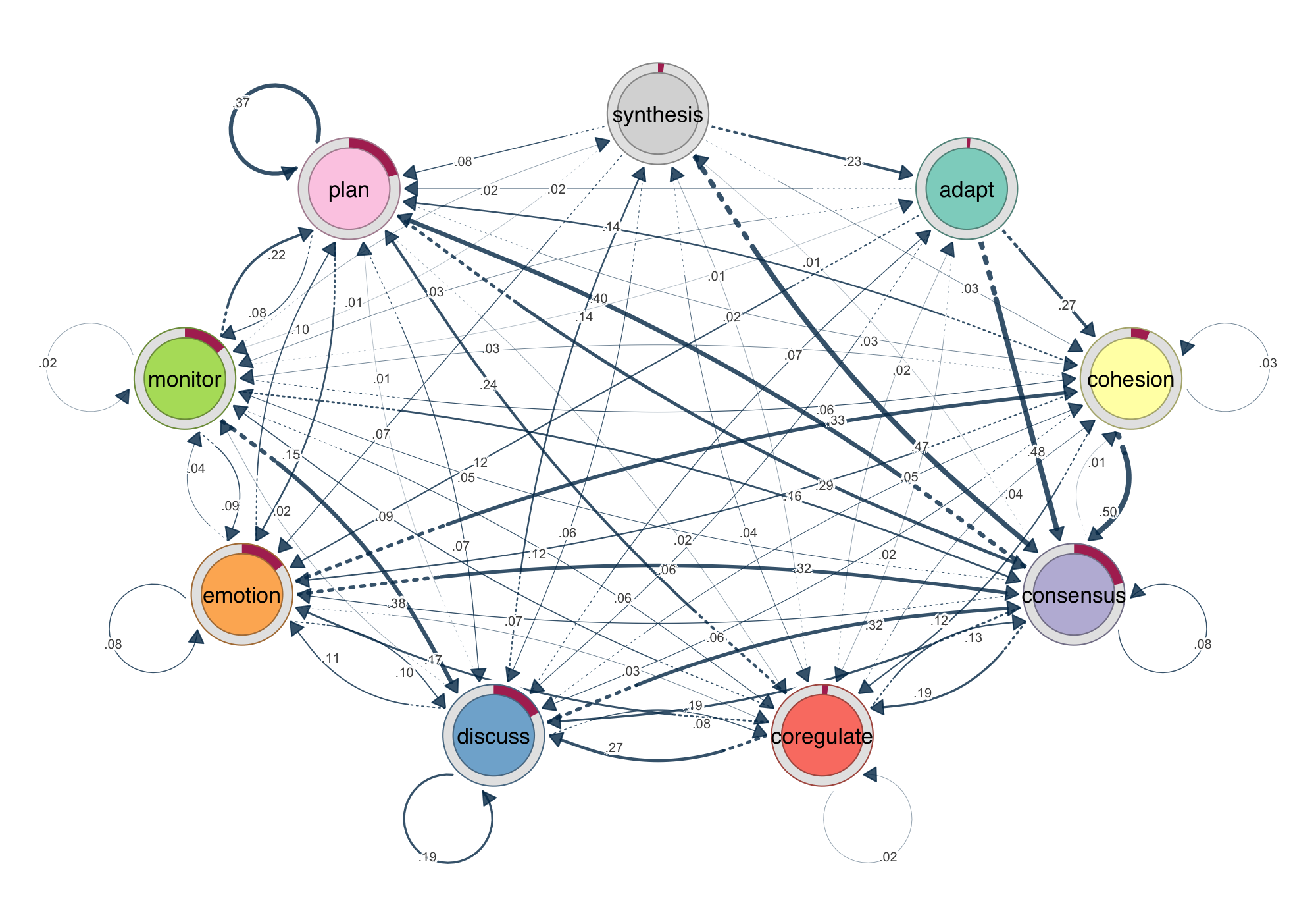
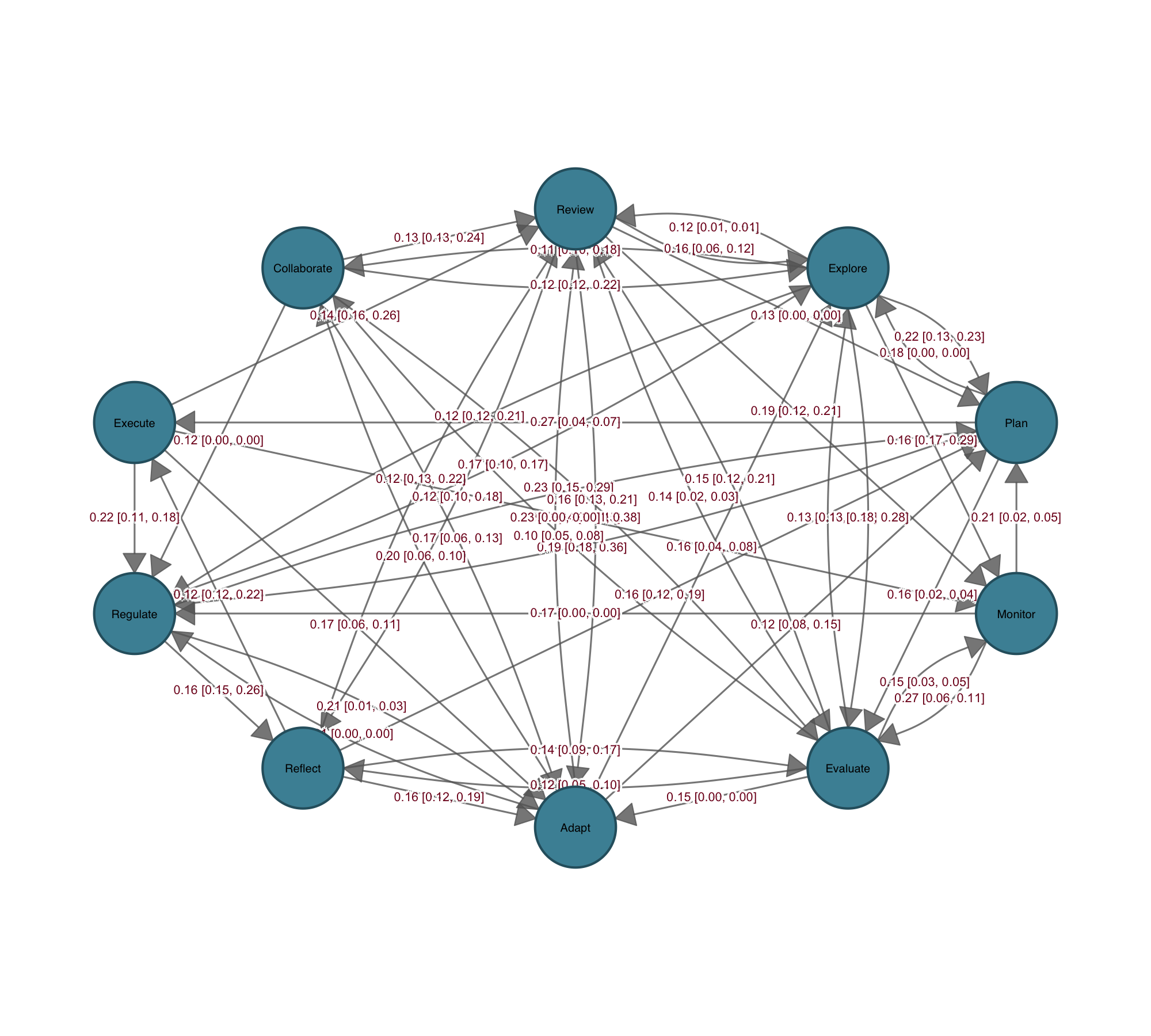
splot(model). Edge width encodes transition probability. Donut rings show initial state distribution. Every example in this post uses the group_regulation dataset from the tna package.1. Do we need another R package for network analysis
R has no shortage of network packages. igraph and statnet are computationally capable, but their function interfaces are inconsistent — argument names, conventions, and behaviors shift depending on what you are doing, and neither was designed with visualization in mind. Each also locks you into its own object format: moving between them means explicit conversion, and anything outside their ecosystem requires manual wrangling. qgraph was built for psychometric computations with tons of depedencies. tidygraph introduced a cleaner grammar, but it still requires non-intuitive synatx that is not very easy with mutate, activate and other conventions. Furthermore, there is no built-in statistical annotation. None of them were built with the full workflow in mind: computation, predictable syntax, beautiful output, statistical results on the figure, and the freedom to move between formats without friction. cograph is.
1. Universal Network Import
Cograph works with your data as it is. Matrices, edge lists, igraph objects, statnet networks, qgraph objects, and tna models are all accepted natively — no preprocessing, no format negotiation, no boilerplate before the actual analysis begins. Directionality is inferred automatically from matrix symmetry or the source object, with a simple directed = TRUE/FALSE override for cases that require it.
Switching between representations is just as frictionless. The conversion functions to_igraph(), to_matrix(), to_network(), to_data_frame(), and as_tna() cover all pairwise transformations across the six supported types, meaning cograph fits into any existing R pipeline without forcing you to reorganize around it. Bring your data in any format, analyze it in cograph, and send it back out in whatever form your downstream tools expect.
2. Fully Compatible with tna
Cograph is built to work seamlessly with the tna package. Pass any tna object directly to splot() and get a publication-ready network plot — no conversion, no extra arguments. The same applies to group models: splot(group_model) lays out all groups in a grid, while splot(group_model, i = "Treatment") isolates a single group.
The integration goes deeper than basic plotting. Bootstrap results from tna::bootstrap() render automatically with solid edges for significant transitions and dashed edges for non-significant ones. Permutation test results from tna::permutation_test() come out with color-coded edges that immediately show which group has stronger transitions. For direct group comparisons, plot_compare() produces difference networks without any manual setup.
Every tna object type is recognized and plotted with appropriate defaults out of the box — tna, group_tna, tna_bootstrap, tna_permutation, and group_tna_permutation. Whatever stage of the tna workflow you are at, splot() knows what to do with it.
library(tna)
model <- tna(group_regulation)

# Plot a tna model directly
splot(model)

# Plot bootstrap results
splot(bootstrap(model, iter = 1000))
## 3. Pipe-Friendly Network Utilities
The entire workflow chains with R’s native pipe. Getters like get_nodes(), get_edges(), get_layout(), and get_groups() extract network structure; setters like set_nodes(), set_groups(), and the sn_* family — sn_nodes(), sn_edges(), sn_layout(), sn_theme(), sn_palette() — modify it. Every function returns the network object, so you build incrementally: set layout, style nodes, adjust edges, pick a palette, render. No intermediate variables, no juggling objects between packages.
4. Filter and Select
Subsetting a network in cograph is as intuitive as subsetting a data frame. Keep only edges above a weight threshold, isolate the top nodes by a centrality measure, or combine both in a single pipeline — the syntax is direct and reads like what you actually want to do.
# Filter: keep only edges with weight above 0.3
filter_edges(net, weight > 0.3)

# Select: keep the top 5 nodes by PageRank
select_nodes(net, top = 5, by = "pagerank")
Every function returns a cograph object, so filtering, selecting, and plotting chain together without ceremony. There is no intermediate representation to manage and no context-switching between tools — just a clean sequence from raw network to final figure.
5. Centrality and Network Properties
One call to centrality(x) computes 25 measures and returns a tidy data frame. Or use individual functions like centrality_degree(x), centrality_betweenness(x), or centrality_pagerank(x) for a named vector. Each function has its own focused help page — no digging through irrelevant parameters. The full list covers degree, strength, closeness, harmonic, betweenness, eigenvector, hub, authority, PageRank, eccentricity, coreness, constraint, laplacian, leverage, power, percolation, subgraph, diffusion, voterank, k-reach, transitivity, and current flow variants. Network-level properties — density, diameter, efficiency, small-world coefficient, rich-club coefficient, bridge detection — are equally accessible through network_summary() and individual functions.
6. Community Detection
Eleven algorithms through a single interface: Louvain, Leiden, Infomap, walktrap, fast greedy, label propagation, edge betweenness, leading eigenvector, spinglass, optimal, and fluid communities — plus consensus clustering for robustness. Each returns a community object with membership vector, modularity score, and a built-in plot() method. Compare partitions with VI, NMI, Rand, or adjusted Rand. Assess quality with modularity, silhouette, and Dunn index. Test significance with permutation-based p-values.
7. Rich Plotting
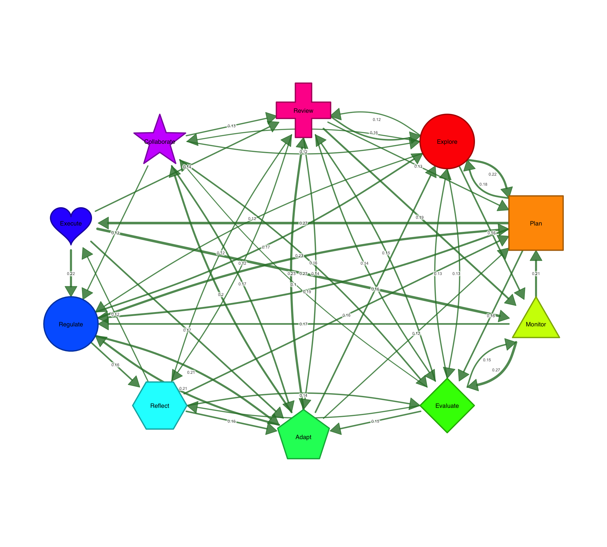
splot(mat) — that is it. One function, any format, publication-ready output. Customize with 80+ parameters for nodes, edges, labels, donuts, pies, and more. soplot() provides the same interface via grid/ggplot2 for layered composition. The range of what cograph draws and how little you need to ask for is what makes it stand out.
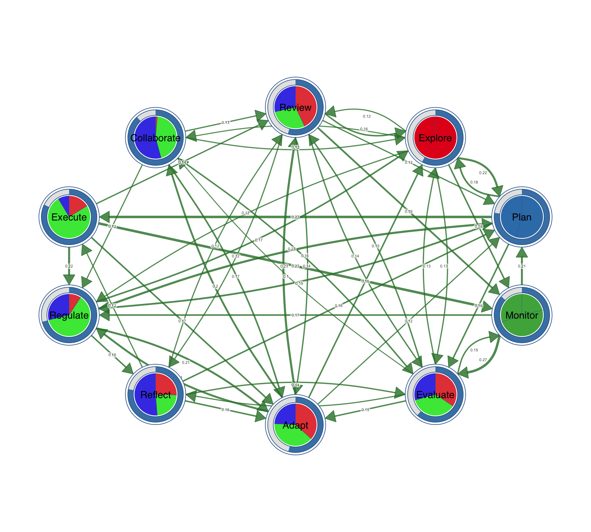
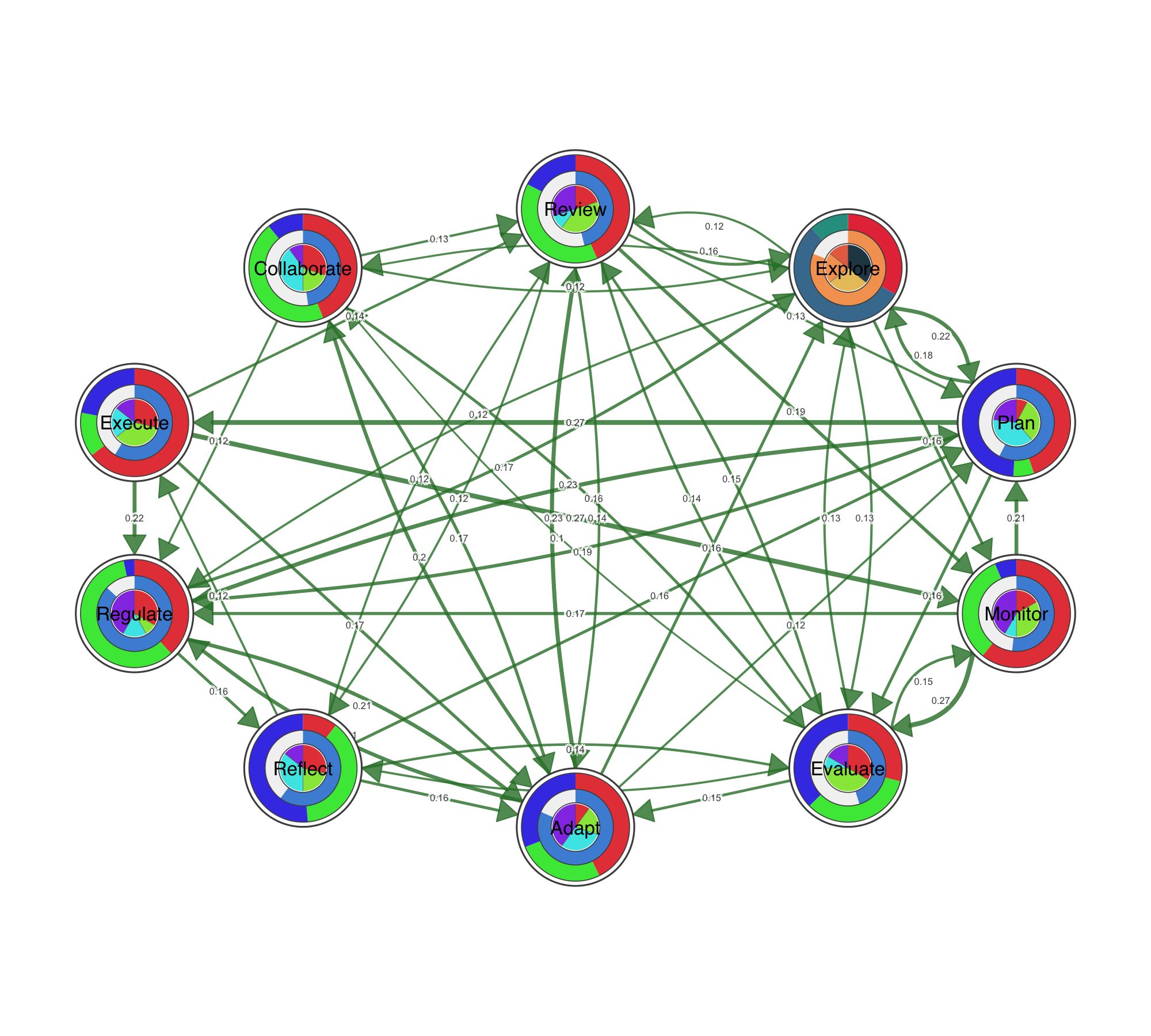
Node Shapes, Pies, and Donuts
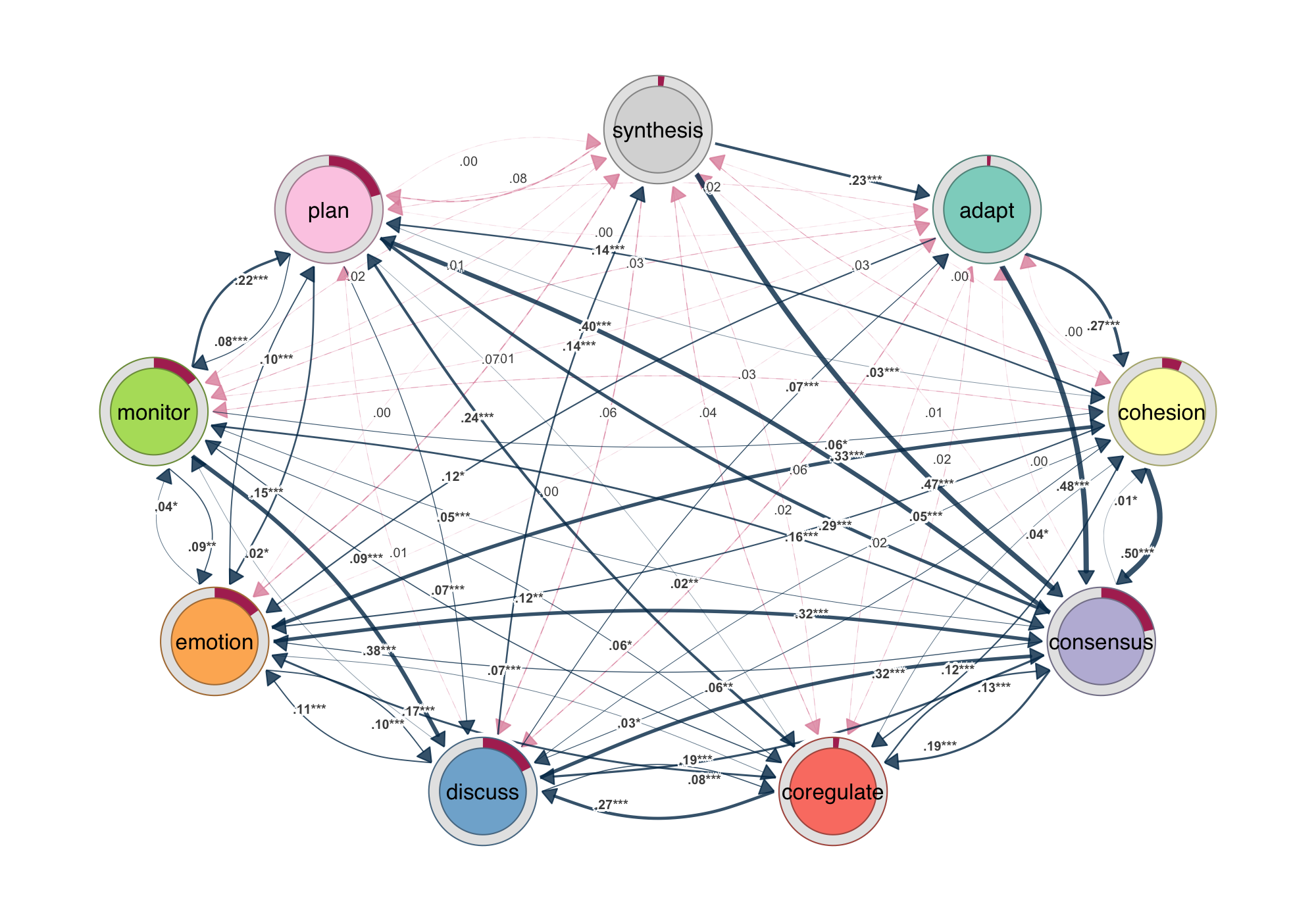
Ten node shapes are available out of the box: circle, square, triangle, diamond, pentagon, hexagon, ellipse, heart, star, and cross. Beyond shapes, nodes can carry data. Pie charts encode category compositions inside the node. Donut rings show proportions around it. You can stack up to three data layers — outer donut, inner donut, and pie core — to encode multiple variables per node, which is particularly useful for representing multidimensional data at a glance.
Visualizing Statistical Data on Networks
Communicating statistical properties of the network or its connections has always been hard. igraph, statnet, and qgraph are built for network computation, not for communicating statistical results through the network itself. Coefficients end up in a table, confidence intervals in a separate forest plot, p-values in a list — disconnected from the structure the analysis was about. cograph is designed around that problem. Confidence intervals render as semi-transparent bands along the edges; p-values map to significance stars directly on the edge labels. The edge label template system lets you compose estimates, CI bounds, and stars in any combination, so regression coefficients, bootstrap intervals, or effect sizes sit on the network itself rather than in a separate table.
Bootstrap results plot directly from the output of tna::bootstrap(): edges that survive resampling appear solid, those that do not appear dashed, with significance stars on the labels. Permutation tests between groups receive the same treatment — edges color-coded by which group shows the stronger effect, non-significant edges suppressed. Side-by-side group plots, difference networks, and overlay views cover the rest, giving you multiple ways to present the same result depending on the question and the audience.
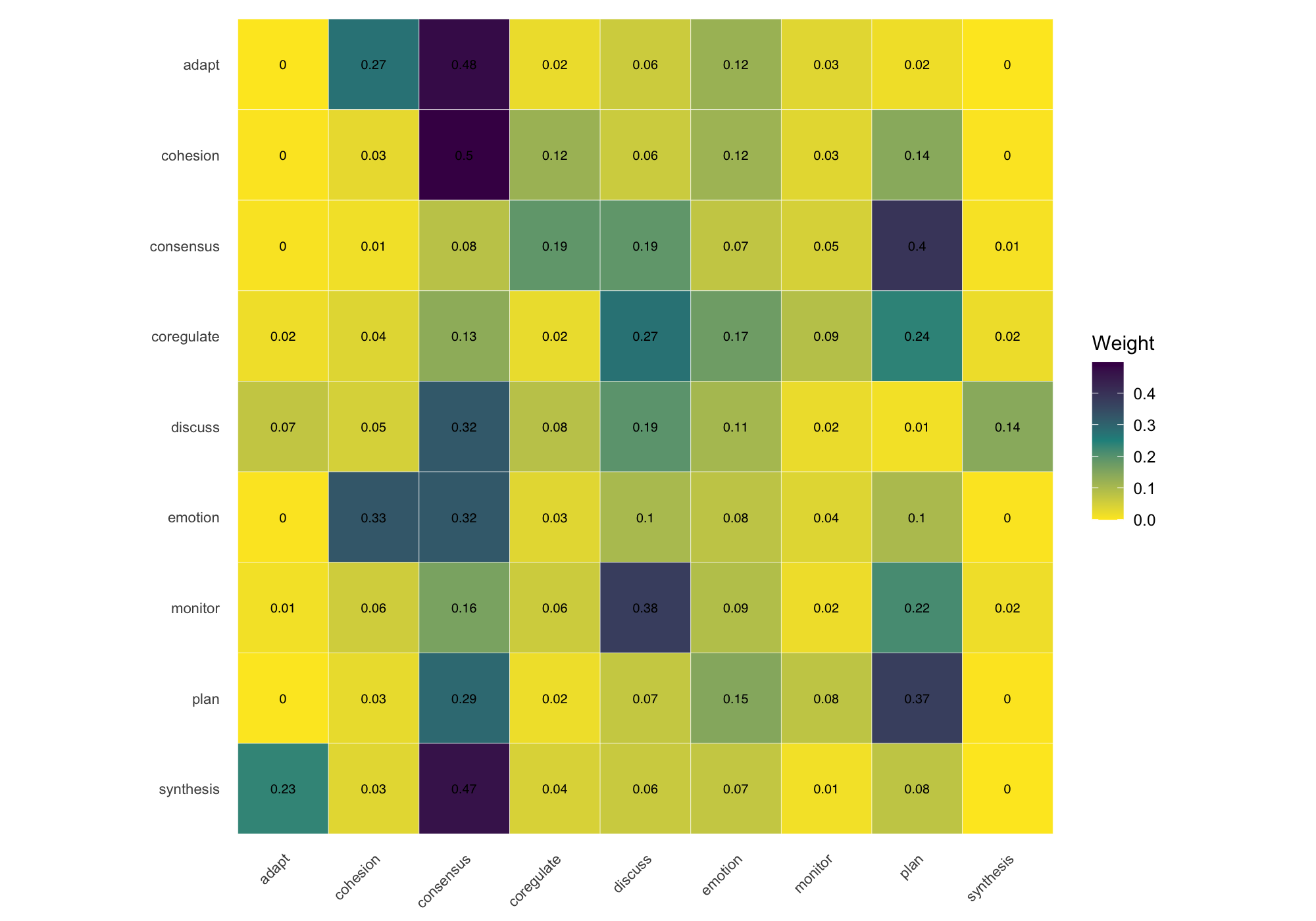
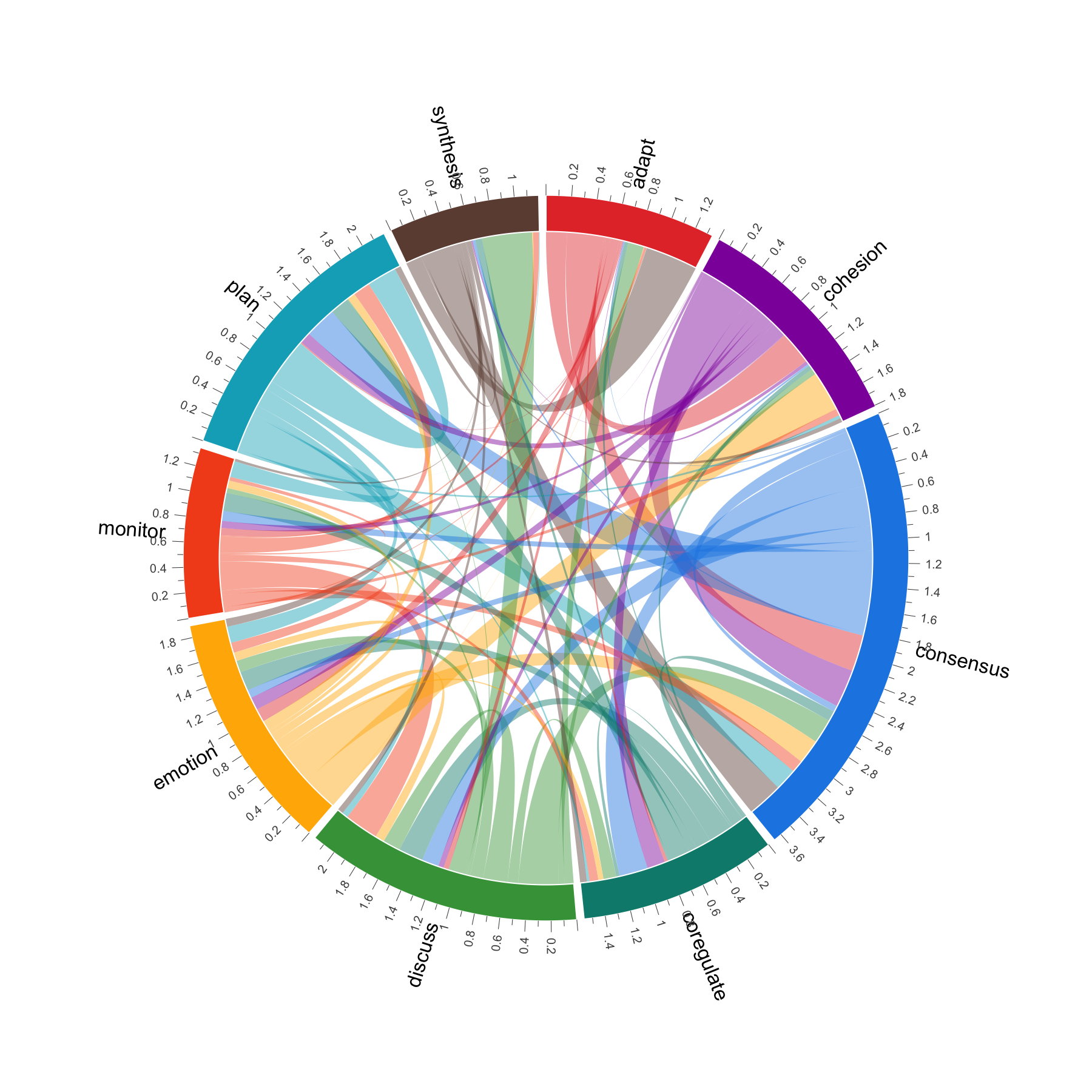
Heatmaps, Chord Diagrams, and Flow Plots
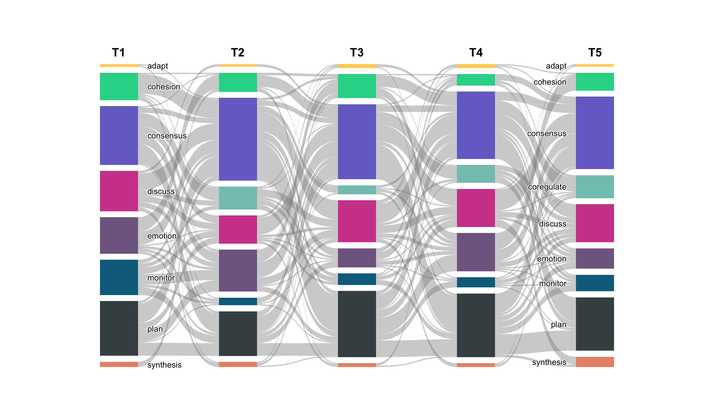
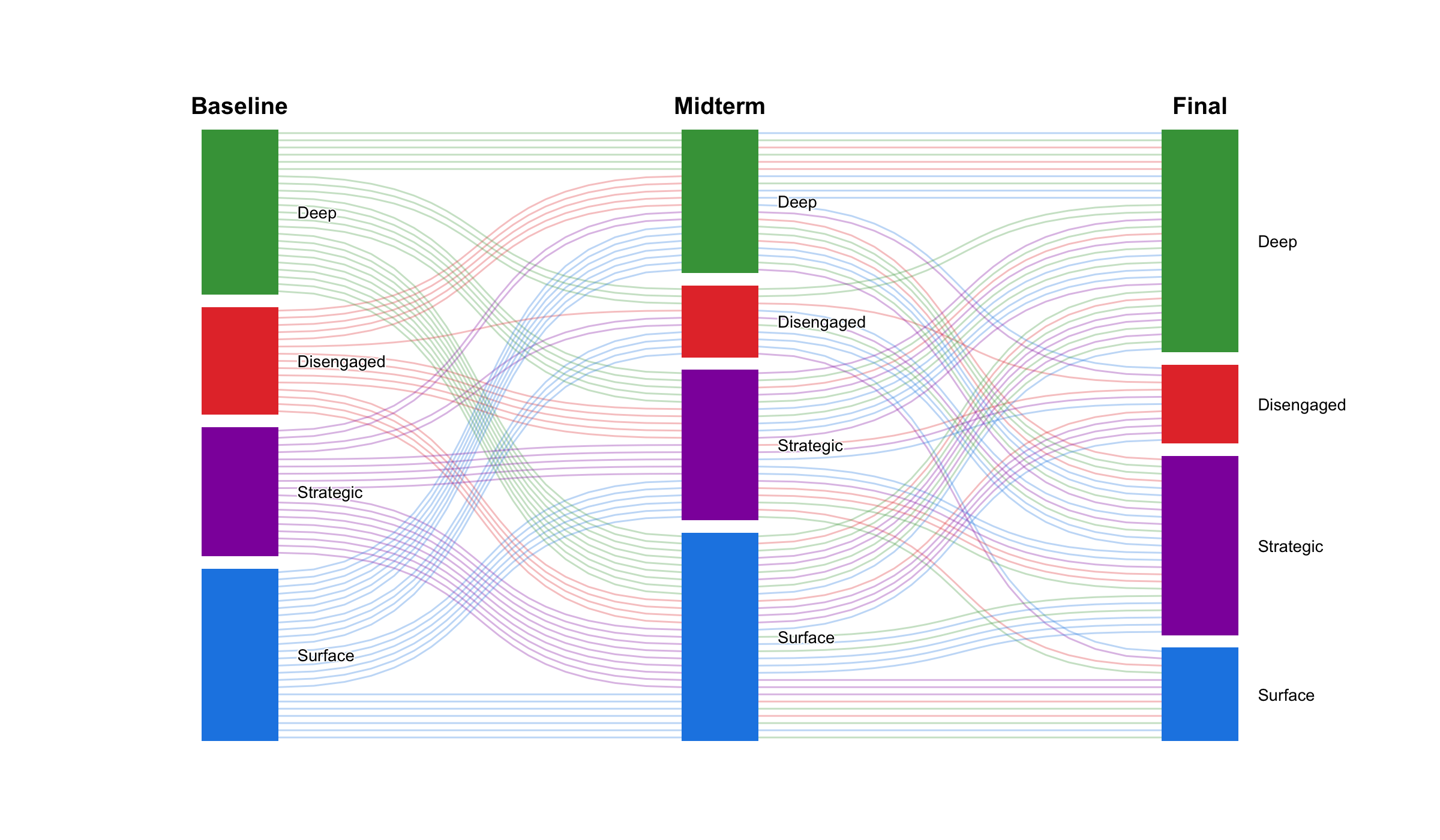
When the node-and-edge view gets too dense, cograph offers alternative representations. plot_heatmap() renders the adjacency or transition matrix as a color-coded grid with optional value overlays. plot_chord() draws circular flow diagrams that emphasize the volume and direction of transitions between states. plot_alluvial() traces how states flow across time points in aggregate, while plot_trajectories() draws each individual as a separate line — useful for seeing whether a group trend actually reflects individual paths or masks divergent behavior. All of these are rendered in base R with no JavaScript dependencies.
Multi-Cluster Networks for Multidimensional Analysis
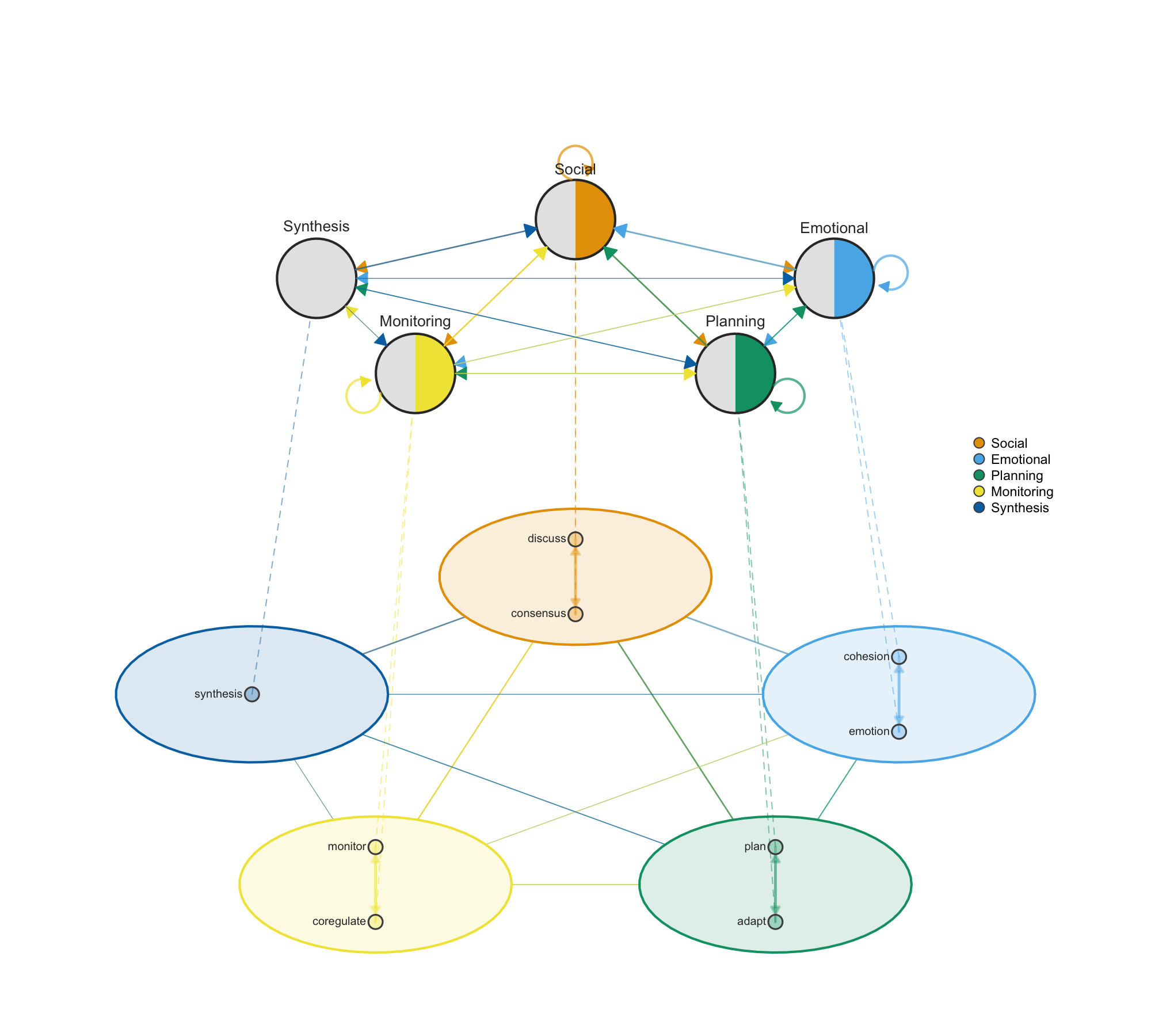
Networks often have internal structure — nodes that group into clusters representing different dimensions, levels, or categories. plot_mcml() facilitates multidimensional network analysis by showing both levels simultaneously: individual nodes arranged inside colored cluster shells on the detail layer, with cluster-level aggregate transitions on the summary layer above. This makes it possible to see micro-level connections and macro-level patterns at the same time, which is essential when studying systems where behavior operates across multiple dimensions such as social, emotional, cognitive, and regulatory processes.
Multilayer and Heterogeneous Networks
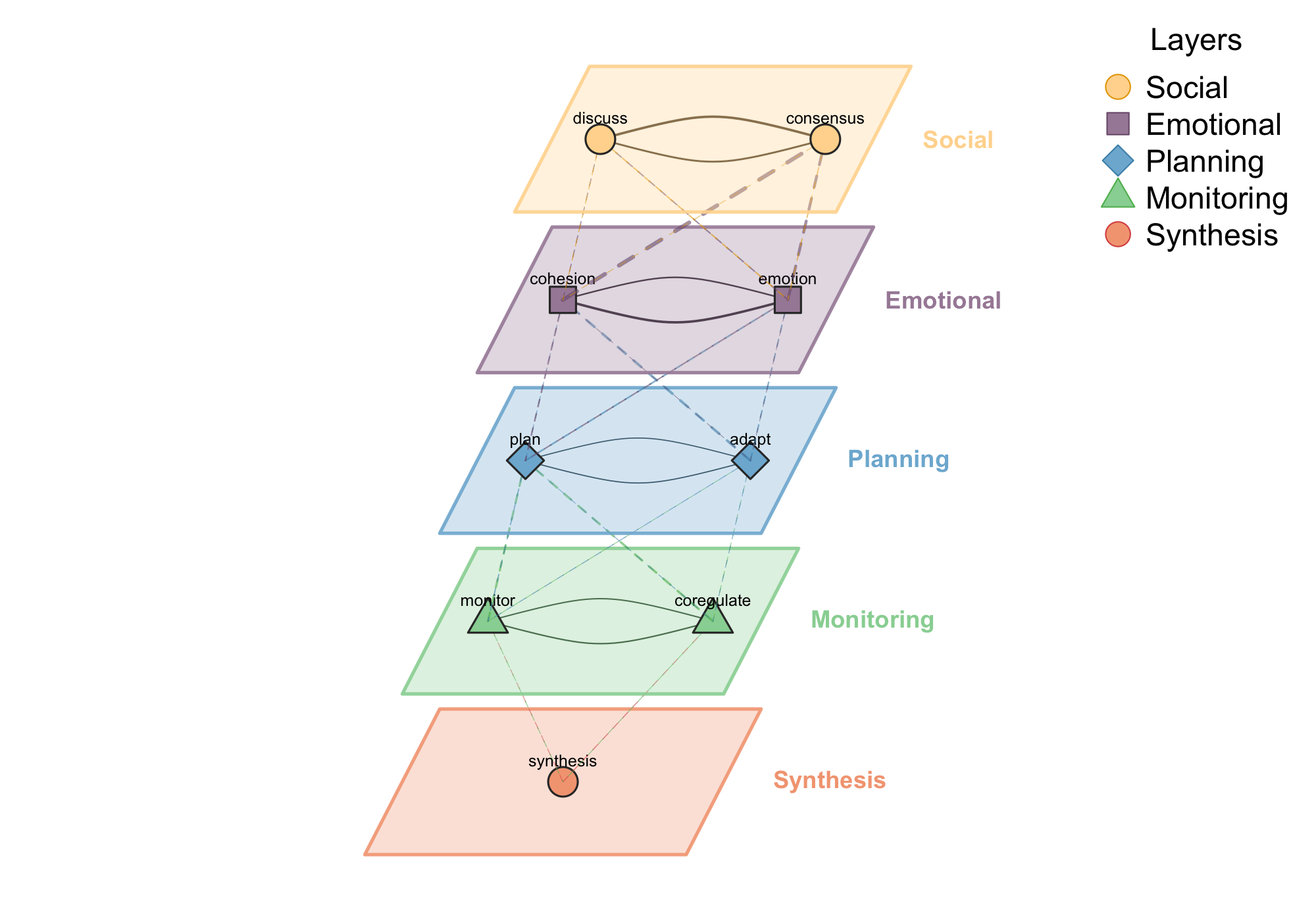
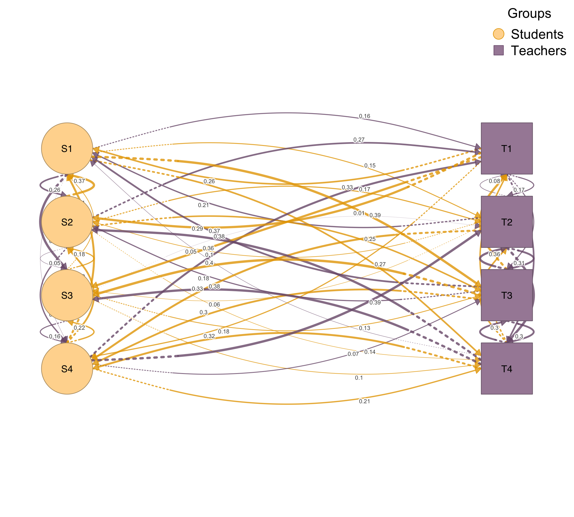
When your network has natural layers — different interaction types, time periods, or modalities — plot_mlna() stacks them in a 3D perspective view with cross-layer connections visible. When you have multiple node types, such as students and teachers or proteins and genes, plot_htna() arranges them in grouped layouts that respect the categorical structure.
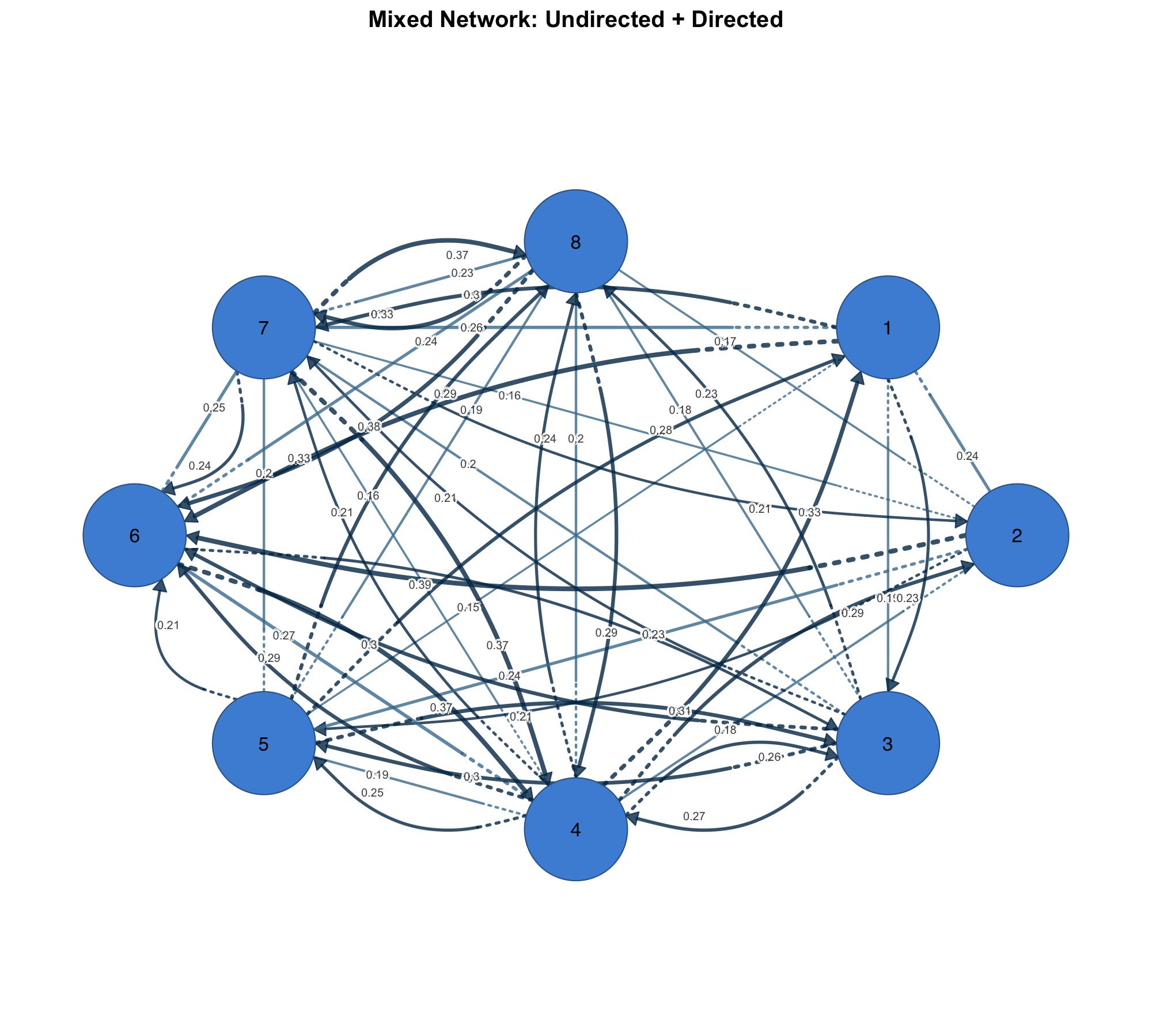
Mixed Networks
Some networks combine symmetric and asymmetric relationships — co-occurrence alongside directed influence, or undirected social ties alongside directed information flow. plot_mixed_network() renders both in one plot with distinct visual styles, so the nature of each relationship is immediately clear.
Getting Started
install.packages("cograph")
# or
remotes::install_github("sonsoleslp/cograph")
cograph provides a unified environment for network analysis and visualization — from importing and converting network data, through computing centrality and detecting communities, to producing publication-ready plots that carry statistical annotations. The goal is simple: write one line, get a result you can put in a paper. For a full reference of all functions, parameters, and examples, read the cograph introduction.
cograph is primarily conceptualized and developed by Mohammed Saqr, Professor of Computer Science at the University of Eastern Finland, and co-developed by Sonsoles López-Pernas, Academy Fellow at the University of Eastern Finland.
| GitHub | Documentation | Full Reference | Plotting Reference |